


Every YouTube video needs a thumbnail as it’s the first thing people see before deciding whether to click or scroll past. Think of it as the “face” of your video. A well-designed and attractive YouTube thumbnail can instantly grab attention, make your content stand out, and encourage viewers to hit play. In fact, a powerful thumbnail can significantly increase your video’s click-through rate (CTR), helping you reach more people and grow your channel faster.
However, creating the right thumbnail isn’t always easy. Many creators struggle to find the perfect balance between clear visuals, bold text, and the right size. That’s why understanding proper YouTube thumbnail dimensions and choosing the best fonts for YouTube thumbnails are essential.
This article will show you how to create an attractive YouTube thumbnail step by step. You will learn what the right YouTube thumbnail dimensions are and font styles to apply. we ‘ll also share simple design tips that make your video impossible to ignore.
What makes a YouTube thumbnail attractive?
Creating an attractive YouTube thumbnail is all about blending the right design elements that instantly capture attention and clearly represent your video’s message. Your thumbnail should be visually striking, easy to understand, and consistent with your channel’s style.
Here are the key elements that make a thumbnail truly stand out:
1. Clarity
An attractive thumbnail communicates its message within a glance. Viewers decide within seconds whether to click, so your image must be sharp, easy to understand, and free of clutter. Using crisp visuals helps ensure your thumbnail stands out when someone scrolls quickly. Clear imagery supports the goals of a strong YouTube thumbnail size and format and aligns with broader YouTube thumbnail design tips.
2. Contrast
Contrast in design means creating a sharp difference between key elements like text, subject, and background. High contrast helps your thumbnail pop, even in small mobile views. Thumbnails with bright or opposing colours catch the eye more effectively ensuring visibility across devices. Use bold text on dark backgrounds or light text on vibrant imagery to stand out.
3. Emotion
Emotion grabs attention and thumbnails that display expressive faces or evoke curiosity, excitement, or surprise generate stronger engagement. Viewers subconsciously respond to human expressions and emotional cues, which helps boost CTR. This plays into how to create an attractive YouTube thumbnail by leveraging emotion as part of your visual hook.
4. Relevance
Your thumbnail must relate exactly to your video’s content. If the image misleads or doesn’t match the subject, viewers feel deceived and the algorithm may penalize you. Relevance means the image, text, and layout reflect what the viewer will actually see.
5. Color
Color influences mood, branding, and recognition. Using a consistent palette can help your channel build a visual identity, while strong color choices can elevate your thumbnail above the noise. Colors like red, yellow, or blue tend to evoke specific feelings (urgency, optimism, trust) and when matched with contrast, they help thumbnails stand out. Aligning with your brand’s hues also reinforces recognition.
6. Composition and placement
The way you arrange elements such as image, text, subject in your thumbnail is crucial. A thoughtful composition directs viewer focus to the subject or headline, and strategic text placement ensures readability on both desktop and mobile. A clean layout enhances a strong YouTube thumbnail by ensuring elements align across devices and maintain impact.
YouTube thumbnail dimensions and fonts guide
Before getting creative with your design, it’s important to start with the right technical setup. Uploading a thumbnail that doesn’t meet YouTube’s standards can cause issues like pixilation, awkward cropping, or blurry visuals all of which reduce your video’s appeal.

Following the proper YouTube thumbnail dimensions ensures your image looks crisp, clear, and professional across all screens.
1. Recommended size and resolution
To keep your thumbnail looking sharp whether viewed on a TV, tablet, or smartphone, stick to these updated specifications:
- Optimal Resolution: 1280 x 720 pixels
- Aspect Ratio: 16:9
- Minimum Width: 640 pixels
While smaller images might still upload, they often lose clarity on larger displays. For the best results, always design using the full 1280 x 720 resolution.
2. File formats and maximum size
YouTube supports a number of image formats for thumbnails, giving creators flexibility while maintaining quality.
- Accepted Formats: JPG, PNG
- Maximum File Size: 2 MB
For most designs, PNG files are preferred because they retain crisp lines and text which are perfect for titles or graphic elements. On the other hand, JPG files work well for photographic thumbnails where smaller file sizes are needed without compromising much on quality.
3. Choosing the right fonts
Fonts play a powerful role in how viewers perceive your video before they even click. The right typography helps your message stand out and reinforces your brand identity. To get the right fonts, consider the following:
- A thumbnail is often viewed on small screens, so every letter must be instantly recognizable.
- Complicated or overly decorative fonts can make your text hard to read, especially on mobile devices.
- Choose readable fonts for thumbnails that remain clear at smaller sizes.
- Keeping your font choices consistent across videos also strengthens brand recognition allowing viewers to spot your content instantly in a crowded feed.
When selecting fonts, simplicity and strength always win. Stick to bold and high-contrast fonts that command attention. These types make your text pop against busy backgrounds and ensure clarity even from a distance. Bold fonts emphasize key words, while high-contrast designs make your titles more dynamic and eye-catching.
Some of the best fonts for YouTube thumbnails include:
- Montserrat: Modern and versatile, perfect for lifestyle or tech content.
- Bebas Neue: Bold and simple, great for headlines and strong visual impact.
- Oswald: Narrow and professional, ideal for educational or review videos.
- Anton: Heavy and striking, perfect for entertainment or reaction content.
When combining fonts, use one for the main headline and another for accents or supporting text. This adds variety without clutter. For example, pair a bold font like Bebas Neue for your title with a lighter option like Open Sans for subtitles.
How to create an attractive YouTube thumbnail
Before now, designing an eye-catching YouTube thumbnail often required expert design skills. But now, with a smart approach and the right tools, you can come up with a great thumbnail for your YouTube content in no time.
To help you out, follow this clear, beginner-friendly process to make your thumbnails stand out and attract more clicks:
1. Choose the right tools
Start by selecting an easy-to-use design platform that gives you creative flexibility. Tools like Canva, Adobe Express, Photoshop, and Fotor are excellent choices for beginners and professionals alike. They offer pre-made templates that follow the correct YouTube thumbnail dimensions and help you stay consistent with your style. Choosing the right tool saves time and ensures professional results without needing advanced design experience.
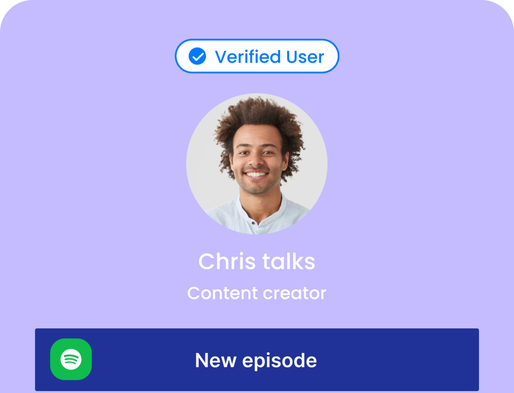
2. Leverage the power of human faces and emotion
Thumbnails featuring people, especially expressive faces are proven to perform better. Humans naturally connect with emotion, so use visuals that show excitement, surprise, curiosity, or joy. Pick high-resolution images that clearly represent your video topic. When viewers see genuine emotion, they’re more likely to feel intrigued and click to learn more.
3. Set correct dimensions
Before adding text or graphics, make sure your canvas fits the recommended YouTube thumbnail size and format of 1280 x 720 pixels with a 16:9 aspect ratio. This ensures your design looks sharp on every screen, from TVs to smartphones. Sticking to these dimensions prevents cropping and blurriness, helping your thumbnail look clean and professional across all devices.
4. Add text strategically
Text can make or break your thumbnail’s effectiveness. Keep your message short; ideally under five words and make it bold and legible even on small screens. Use contrast (like white text on a dark background) to improve readability. Large, high-contrast text instantly communicates your video’s value. This aligns with core YouTube thumbnail design tips that emphasize visual simplicity and strong focus.
5. Choose consistent fonts
Stick to one or two font styles throughout your thumbnails to maintain a recognizable look. Using consistent typography builds your visual identity and helps viewers identify your videos at a glance. Select fonts that are easy to read, such as Montserrat, Bebas Neue, or Anton. Consistency also strengthens your overall branding and enhances your channel’s professional image.
6. Use contrasting colors for visibility
Color plays a huge role in grabbing attention. Warm colors like red, orange, and yellow create a sense of urgency and excitement, while cool colors such as blue, green, and purple give a calm, professional impression. Stick to a color palette that matches your channel’s theme for brand recognition. Balanced color contrast helps key elements pop without overwhelming the viewer.
7. Create a clear visual hierarchy
Arrange elements in a way that guides the viewer’s eye naturally. Your main subject or headline should be the focal point. Use arrows, highlights, or subtle overlays to draw attention to important areas. Avoid clutter as too many objects, faces, or words can confuse viewers. A simple, well-structured layout ensures your thumbnail remains clean and visually appealing.
8. Optimize for different display across YouTube
Your thumbnail appears in several places on YouTube such as search results, suggested videos, mobile feeds, and embedded on other sites. Each location displays it at different sizes, so test your design across multiple devices. If it looks blurry or cropped, adjust your YouTube thumbnail dimensions to ensure it remains clear everywhere. Always preview before uploading to guarantee the best presentation.
9. Use YouTube’s “Test & Compare” feature
YouTube’s Test & Compare feature is a powerful tool for creators. It allows you to upload up to three different thumbnail versions for one video and automatically test them with your audience. After a short period, YouTube shows which thumbnail achieved the highest click-through rate (CTR) and watch time. When publishing a video, find the “Test & Compare” option in the thumbnail upload section.
You can use this to experiment with one element at a time. For example, a thumbnail with your face versus one without, or two different color themes and text placements. Analyze the data and apply your findings to future designs. Over time, you’ll learn what type of YouTube thumbnail design connects best with your audience.
10. Use templates
Designing from scratch for every video can be tiring and time-consuming. That’s where templates come in handy. A thumbnail template gives you a ready-made design framework that you can quickly customize for each upload.
You can easily swap out images, text, or background colors without rebuilding your design. This not only saves time but also ensures your thumbnails look professional and consistent. If you manage multiple social platforms, then use a template bundle. This ensures your YouTube thumbnails, posts, and stories all share the same clean, branded look, helping you stay efficient while maintaining your unique style.
FAQ
Should I always put a face in every YouTube thumbnail?
Not always, but it often helps. Thumbnails featuring expressive human faces tend to get higher click-through rates because they create an emotional connection. Viewers naturally respond to facial expressions like excitement, surprise, or curiosity. However, if your content doesn’t include people for example, tutorials or product demos, you can still make your YouTube thumbnail design engaging with bold text, clear visuals, and strong color contrast.
How do I know if my thumbnail is good before publishing?
A simple way to check is by doing the “glance test.” Shrink your thumbnail to a small size and look at it for just a second or two. Ask yourself:
- Can I immediately understand what the video is about?
- Is the text readable?
- Does it stand out from others in the feed?
If your answer is “yes” to all three, it’s likely a strong design.
Is it okay to use ‘clickbait’ in thumbnails?
It’s better to avoid misleading clickbait. While exaggerated images or shocking titles may grab attention short-term, they can hurt your channel’s credibility and audience trust. Instead, focus on honest, curiosity-driven thumbnails that accurately represent your video. Engaging visuals paired with the right YouTube thumbnail size and format are more effective for sustainable growth.
Is a YouTube thumbnail a PNG or JPEG?
Both formats work, but each has its strengths. PNG files are ideal for graphics, logos, and text-heavy designs because they keep edges sharp and colors vibrant. JPEG files are better for photographic thumbnails since they balance quality with smaller file sizes. As a general rule, keep your image under 2 MB and follow the standard YouTube thumbnail dimensions (1280 x 720 pixels) for best results.
Wrapping up
Your YouTube thumbnail is often the very first thing people notice and it’s your opportunity to make a lasting impression before anyone hits play. Getting your YouTube thumbnail dimensions and font choices right can make all the difference between someone clicking your video or scrolling past it.
A well-sized, visually balanced thumbnail ensures your design looks sharp across all screens, while clear, readable fonts help your message stand out instantly. Creators who master YouTube thumbnail dimensions and fonts can create attractive thumbnails that boost their views and help their videos stand out on the world’s biggest video platform.


![Instagram Captions for Business to Boost Conversion [+50 Examples]](https://www.pushbio.io/wp-content/uploads/2025/10/Instagram-Captions-for-Business-to-Boost-Conversion-50-Examples-740x740.png)