

Visual content on LinkedIn is now a necessity. With over 1 billion members on the platform and LinkedIn processing more than 2.5 million posts every single day, the competition for attention in the feed has never been more intense. Posts with images receive more comments than text-only posts. Yet a significant number of those image posts underperform, not because the content is weak, but because the dimensions are wrong.
A cropped logo, pixelated banner, or awkwardly stretched thumbnail immediately signals a lack of professionalism on a platform built entirely around professional credibility. This makes understanding LinkedIn post image sizes and dimensions the difference between content that commands attention and content that gets scrolled past. LinkedIn’s own algorithm promotes content that drives higher engagement, and properly formatted visuals directly contribute to that engagement signal. Getting LinkedIn image dimensions right is not a technicality. It is a core part of your content strategy.
This guide gives you every LinkedIn image size specification you need for profile photos, cover images, single-image posts, carousels, article headers, video thumbnails, event images, and sponsored ads. We cover the correct dimensions for both personal profiles and company pages, explain the file format and size requirements that prevent upload failures.
What’s new for visuals on LinkedIn?
LinkedIn continues evolving beyond a professional networking site into a content-driven, AI-enhanced ecosystem, where quality visuals and engagement signals increasingly determine reach. In recent years, LinkedIn has expanded AI tools for creators, including automated content suggestions, smarter feed personalization, and deeper analytics so users can track post performance, including how visuals contribute to impressions and interactions.
1. Platform updates and visual content features
LinkedIn’s updates include enhanced post analytics with metrics for profile views, saves, and sends. All of these are key indicators of visual content effectiveness and expanded support for vertical video and rich media formats. This makes visuals and video even more central to engagement strategies.
Verification growth is increasing trust and visibility for creators and organizations, which can boost engagement on posts with professional visuals. New ad formats like Reserved Ads and Personalized Ads have also been introduced, enabling more visually impactful placements in user feeds.
2. Document and native content prioritization
LinkedIn’s algorithm now strongly favors native content (documents, videos, and original visuals) over external links, pushing multi-page PDF “document” posts and native videos higher in feeds. Document posts, in particular, outperform many other formats because they increase dwell time and encourage users to swipe through content.
3. Algorithmic shifts affecting images
In 2026, LinkedIn’s ranking systems are focusing on deeper engagement over surface metrics like vanity likes. Meaningful interactions such as long comments, saves, shares, and time spent on posts now influence reach more than ever. Also, visuals that sustain attention are ranked more favorably. Interest-based distribution means images tied to niche, relevant topics can reach beyond your immediate followers, aligning content with user interests instead of pure network size.
Why getting LinkedIn image dimensions right matters
Before listing the specifications, it’s worth understanding the business case. Correct LinkedIn image sizes impact four things directly:
1. Algorithmic reach and engagement
Correct image dimensions help LinkedIn’s algorithm recognize and display your visuals properly thereby boosting engagement. LinkedIn’s feed prioritizes posts that offer a good user experience (including clarity and fit on screen), so images that fit recommended size guidelines tend to generate higher likes, comments, and clicks.
When an image is too small or improperly sized, the platform compresses or crops it, which can harm visual quality and reduce its appeal, lowering dwell time and the likelihood of algorithmic promotion. Proper sizing also supports clear focal points and readable text overlays, directly influencing how users interact with the content.
2. Mobile optimization and responsiveness
A majority of LinkedIn users browse on mobile devices, making mobile optimization essential for image content. Images that follow size guidelines display consistently on phones, tablets, and desktops, preventing awkward stretching or cropping that can obscure important visual elements or text.
Without correct dimensions, images may shift layout or zoom differently across devices, disrupting the user experience and potentially turning viewers away before they even read your caption. Using correct ratios and sizes ensures that visuals maintain their integrity, no matter where someone views them.
3. Brand Consistency and Professionalism
LinkedIn is a professional networking platform where visual presentation significantly impacts credibility. Displaying logos, colors, and branded elements at the right dimensions ensures they appear sharp and undistorted, reinforcing your brand identity.
Images that are pixelated, warped, or poorly cropped create a disjointed, low-quality appearance that can undermine trust and make your content feel amateurish. Maintaining consistent, clean visuals across posts, banners, and profile elements signals attention to detail; a key trait in professional branding.
4. First impressions and visual integrity
LinkedIn often automatically crops and compresses images that don’t meet its recommended specifications, and this can drastically alter how your visuals appear in users’ feeds. First impressions happen in a split second; if your image looks distorted or key information is cut off due to improper sizing, viewers may scroll past before engaging.
Using the recommended dimensions prevents LinkedIn from making unpredictable cropping decisions and helps ensure your visual message is communicated clearly and professionally from the first moment.
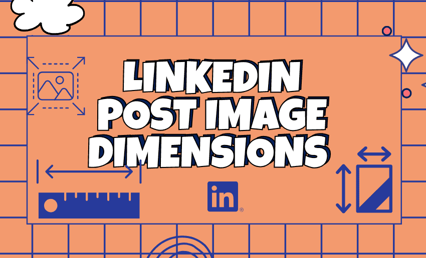
Complete guide to LinkedIn post image sizes and dimensions
Using the correct image sizes on LinkedIn ensures your posts display clearly across desktop and mobile without cropping or distortion.

And with LinkedIn having multiple visual content format, we will cover the recommended dimensions for single-image posts, multi-image carousel posts, link preview images, document posts, LinkedIn articles, and profile or page updates. Additionally, we will include updated aspect ratios, file size limits, and formatting tips for each post type
1. Profile image sizes: Personal and company pages
Personal profile photo

Your profile photo appears in the feed beside every comment, post, and connection request you make. LinkedIn automatically crops your profile photo into a circle, so avoid placing important elements near the edges.
- Recommended size: 400 x 400 pixels
- Minimum size: 268 x 268 pixels
- Aspect ratio: 1:1 (square)
- Maximum file size: 8 MB
- Supported formats: JPG, PNG, GIF
Pro tip: Center your face and let it fill 60–70% of the frame. Use a neutral background and professional lighting. Avoid placing anything important near the edges as the circular crop will remove it.
Personal profile cover (Banner) image
Your banner is the wide background image visible at the top of your personal profile page. It is your first impression as a personal brand.
- Recommended size: 1584 x 396 pixels
- Aspect ratio: 4:1
- Maximum file size: 8 MB
- Supported formats: JPG, PNG
Avoid text-heavy banners. Instead, use simple, bold visuals or logos. If you do include text, make sure it doesn’t get obscured by the profile image on desktop or mobile.
Company page logo
- Recommended size: 400 x 400 pixels
- Maximum file size: 4 MB
- Supported formats: JPG, PNG, GIF
Company page cover image
- Recommended size: 1128 x 191 pixels
- Maximum file size: 4 MB
- Supported formats: JPG, PNG, GIF
Important: The company page cover image displays differently than personal banners. At 1128 x 191 pixels, it is wider and flatter. Keep logos and text centered and away from the edges to prevent cropping on mobile.
2. LinkedIn post image sizes: Feed content
Single image post

This is the most common LinkedIn post format. LinkedIn supports images up to 36 megapixels, though optimizing file size under 5–8 MB is recommended for faster loading.
Single image posts come in three orientations:
|
Orientation |
Dimensions | Aspect Ratio | Best Use |
| Landscape | 1200 x 627 px | 1.91:1 | Storytelling, link previews, banners |
| Square | 1080 x 1080 px | 1:1 | Brand updates, quotes, announcements |
| Portrait | 1080 x 1350 px | 4:5 |
Infographics, text-heavy visuals |
The image dimension is 1200 x 627 pixels in size (1.91:1). It’s important to keep images under 5MB for faster load times.
Square images are often the safest default choice. Square posts display evenly across desktop and mobile feeds, reducing the risk of unwanted cropping.
Portrait images work best for infographics and text-heavy content because they take up more vertical space in the mobile feed which means more visual real estate before a user scrolls.
Critical design rule: Keep your important text, logos, or CTAs inside the center 80% of your design. This prevents accidental cropping on mobile screens and keeps your main message visible.
Multiple image posts
LinkedIn allows up to 9 images in a single post. When multiple images are uploaded, LinkedIn displays them in a collage format. Maintain consistent dimensions across all images in the same post to avoid misaligned grids.
- Recommended size: 1200 x 1200 px (1:1 ratio) per image
- Maximum file size: 5 MB per image
3. LinkedIn carousel and document post sizes
Document posts (PDF carousels) are LinkedIn’s highest-engaging native format, generating 3x more engagement than static images. This makes getting carousel dimensions right especially important.
Carousel post (PDF document)
- Recommended dimensions: 1080 x 1080 px (square) or 1080 x 1350 px (portrait)
- Alternative: 1920 x 1080 px (landscape)
- File format: PDF only
- Maximum file size: 100 MB
- Maximum pages: 300 slides (though 10–20 is optimal for engagement)
- Maximum file size per slide: 10 MB
Carousels are perfect for tutorials, case studies, or educational marketing content. Consistency matters here as all carousel slides must remain consistent in their size. A successful carousel is way more than a random set of images; it is a carefully structured journey for the viewer.
Best practices for carousels:
- Use the first slide as a cover page with a compelling headline
- Maintain a consistent color palette and font across all slides
- Include a call-to-action on the final slide
- Keep text large enough to read on mobile without zooming
4. LinkedIn video post sizes

Video is among LinkedIn’s highest-reach content formats when used correctly. Getting technical specifications wrong causes upload failures, poor playback quality, or disqualification from the feed.
Native video (Feed post)
- Recommended resolution: 1920 x 1080 px (landscape, 16:9)
- Minimum resolution: 640 x 360 px
- Maximum resolution: 4096 x 2304 px
- Aspect ratios supported: 16:9 (landscape), 9:16 (portrait), 1:1 (square)
- Recommended duration: 15 seconds to 10 minutes (shorter performs better)
- Maximum file size: 5 GB
- Maximum duration: 10 minutes for organic posts
- Supported formats: MP4, ASF, FLV, MPEG-1, MPEG-4, MKV, WebM, H264/AVC, VP8, VP9, WMV2, WMV3
Unsupported formats like AVI, QuickTime, and MOV may need conversion. Balancing file size with quality is essential to avoid slow loading times.
Video thumbnail
LinkedIn does not specify exact pixel dimensions for video thumbnails. However, use these aspect ratios to ensure thumbnails display correctly:
- Vertical: 4:5 or 9:16
- Landscape: 16:9
- Square: 1:1
Recommended thumbnail size as a practical guideline: 1280 x 720 px for a professional result similar to YouTube thumbnail standards.
5. LinkedIn article and newsletter image sizes
Article feature image
The feature image appears in your followers’ feeds as a preview and at the top of the article itself. This is a critical click-driver for long-form content.
- Recommended size: 1200 x 644 px
- Minimum size: 600 x 322 px
- Aspect ratio: Approximately 1.91:1
Post images appear directly in the feed (1200 x 627 px optimal), while article feature images (1200 x 644 px) appear at the top of LinkedIn articles and newsletters.
Newsletter header image
LinkedIn newsletter headers should be 1280 x 720 pixels (16:9 ratio). This ensures your newsletter looks professional both in the creation interface and when subscribers view it.
Article banner image
- Recommended size: 600 x 322 px
- This appears inside the article body at the top, separate from the feature image.
6. LinkedIn event image sizes
LinkedIn Events are underused but can generate significant engagement and lead generation. The event image is one of the first things potential attendees see.
- Recommended size: 1776 x 444 px
- Aspect ratio: 4:1
- Supported formats: JPG, PNG
- Maximum file size: 8–10 MB
Design tip: Use high-contrast colors and simple designs to make your event image stand out in the LinkedIn feed. Include the event name, date, and a clear visual hook. Avoid cluttered layouts as mobile users will see a compressed version.
7. LinkedIn sponsored Ad image sizes
For paid content, dimensions matter even more. Incorrectly sized ad creatives are rejected at upload or display poorly, wasting your ad budget.
Single image sponsored content (Ad)
- Recommended size: 1200 x 627 px
- Aspect ratio: 1.91:1
- Maximum file size: 5 MB
- Supported formats: JPG, PNG
Sponsored content square Ad
- Recommended size: 1200 x 1200 px
- Aspect ratio: 1:1
Sponsored content portrait Ad
- Recommended size: 627 x 1200 px
- Aspect ratio: 9:16
Video Ad
- Recommended resolution: 1920 x 1080 px
- Maximum file size: 200 MB
- Duration: 3 seconds to 30 minutes (15–30 seconds performs best for conversion)
LinkedIn ads reach a highly targeted audience of professionals, so maintaining high-quality images and videos is crucial for conversion. Ads with the wrong dimensions can appear distorted or poorly cropped, which can negatively impact engagement.
Pro tip: Use A/B testing with different image formats (square vs. landscape) to identify which performs better for your specific audience before scaling your budget.
File Format Guide: When to Use JPEG vs. PNG vs. WebP
Choosing the right file format affects both image quality and loading speed; both of which affect engagement. Use JPEG for photographs to keep file sizes small. Use PNG for graphics with text or when you need transparency. Both formats are well-supported.
| Format | Best For | Pros | Cons |
| JPEG/JPG | Photos, lifestyle images | Smaller file size, faster load | No transparency, some quality loss |
| PNG | Graphics, logos, text-heavy images | Sharp text, supports transparency | Larger file size |
| GIF | Animated graphics | Supports animation | Limited color palette |
| WebP | Modern web graphics | Small file size with high quality | Not all LinkedIn interfaces support it |
File size targets:
- Profile and cover photos: Under 8 MB
- Feed images: Under 5 MB
- Videos: Under 5 GB but aim for the smallest file size that maintains quality.
Large files cause slow loading or upload failures. Compress images using tools like Squoosh or TinyPNG before uploading without sacrificing visible quality.
Optimization strategy that top LinkedIn creators use
Knowing the correct dimensions is step one. Using them strategically is step two. This is where knowledge becomes practical. Here are some proven strategies that top creators on LinkedIn use to improve on reach and engagement:
1. Match format to content goal
On LinkedIn, landscape images tend to be more effective for visual storytelling, while portrait images are better suited for infographics and text-heavy visuals. Don’t choose square simply because it’s safe, choose the format that best presents your specific content.
2. Post-type performance hierarchy
Based on current LinkedIn engagement data, here’s how content formats rank for engagement:
- Document carousels (PDFs): 3x more engagement than static images
- Native video: 5x more reach than other content types (LinkedIn data)
- Single images with minimal text: High engagement for brand building
- Multi-image posts: Strong for showing process, before/after, or portfolios
- Articles with strong feature images: Best for long-term authority building
3. The 80% safe zone rule
Design all your LinkedIn images with a mental frame: nothing critical should appear within the outer 10% border of your image. Keep text, logos, faces, and CTAs inside the central 80% of the frame to ensure they remain visible across all devices and contexts, including notification previews and mobile feeds.
4. Content calendar by image format
Using one content format will quickly bore out your audience. A rotating format strategy maximizes engagement:
- Monday: Industry insights using data visualization images (landscape)
- Tuesday: Tips and tactics via carousel (square, 1080 x 1080 px)
- Wednesday: Personal story with an authentic photo (square or portrait)
- Thursday: Educational infographic (portrait, 1080 x 1350 px)
- Friday: Milestone celebration or team photo (landscape)
5. Always preview before publishing
Before you hit “post,” check how your content looks on a mobile device. What looks perfectly centered on a 27-inch desktop monitor often appears misaligned or cropped on a 6-inch phone screen. Most social media scheduling tools including Pushbio, Buffer, and SocialPilot include mobile preview features precisely for this reason.
6. Tools for creating LinkedIn-optimized images
You do not need a designer to get dimensions right. These tools handle specifications automatically:
- Canva: Pre-built LinkedIn templates in exact dimensions. Free tier available.
- Adobe Express: Professional templates with brand kit integration.
- Figma: Professional design tool for teams creating branded content at scale.
- Crello/VistaCreate: Template library with platform-specific presets.
In the end
Getting LinkedIn post image sizes right doesn’t require technical perfectionism. It requires ensuring your message lands the way you intended. A header image with the wrong dimensions might cut off an important message or a chunk of your logo. On a platform where professional credibility is the entire value proposition, visual errors cost you trust before you say a single word.
Content strategy and image dimensions work together, not separately. The right message, sized correctly for the right format, on the right day is the combination that drives real LinkedIn engagement, real reach, and real professional results. Use the quick-reference table in this guide every time you create LinkedIn content.